
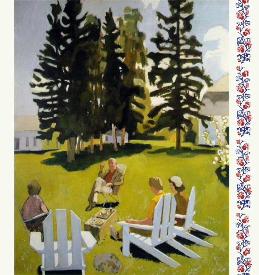
Dan Robbins was a competent painter. He was not a great painter. He knew that about himself. Robbins made a living in the art departments of car manufacturers until, in 1949, he was hired by the Palmer Show Card Paint Company and tasked with selling more paint. Robbins was no student of art history, but he had heard of a strategy that Leonardo da Vinci employed which allowed his students to finish massive swaths of the master’s works without his oversight, and Robbins had an idea:
[Leonardo] would hand out numbered patterns indicating where certain colors should be used in specific projects such as underpainting, preliminary background colors or some lesser works that did not require his immediate attention. What a great idea! Why not do the same thing for anyone who wants to paint their own picture but can’t.
Robbins’ first prototype, finished in 1950, was called “Abstract No. One” — a nod to the abstract expressionism that was at its zenith at precisely that time (Woman I was painted that same year) — but his boss nixed that painting and told him to come back with something prettier and more marketable.
Robbins came up with six such canvases. He painted each one, waited for it to dry, placed a plastic sheet over it, and then outlined the shape of every stretch of canvas that had a single solid hue. Next Robbins assigned every color a number and matched the shapes to their corresponding color numerically. Voila. “Every man a Rembrandt” — that’s what the box promised. It hit the market in 1951. Eight hundred employees were hired to churn out 50,000 kits a day. Twenty million kits were sold in 1951. President Eisenhower’s administration was so fond of the pastime — the president was himself a painter — that the Presidential Appointments Secretary Thomas Edwin Stephens handed out kits to Oval Office visitors and the completed works were sent back and displayed around the West Wing. (In 2023 an exhibition called “By the Numbers,” consisting of such paintings that had been completed by members of the Eisenhower Administration, was mounted at the Eisenhower Presidential Library and Museum in Abilene; twenty years earlier a show on the same theme was presented at the National Museum of American History in Washington, with the charming subtitle “Accounting for Taste in the 1950s.” )
The Paint By Number Collection at the National Museum of American History covers the years between 1952 and 1957. 1952, as it happens, was the year that Fairfield Porter started exhibiting at the Tibor de Nagy Gallery in New York City.

At the crack of dawn on a Monday morning this past August I rose and somnambulated to Union Station, hopped the earliest train to Moynihan Train Terminal in New York and, four hours later, stumbled onto Eighth Avenue and walked the way up to the Arts Students League just below Central Park. I had come with a purpose: this was the last day that “Fairfield Porter: What Everyone Knows” would be up on the second floor of that famed establishment. I have admired Porter from a distance for years. Though I had not, before this summer, ever actually seen a Porter painting in person, I had studied images of the paintings and even used a few as references for my own canvases. For months I had looked forward to this exhibition and to the reviews it would elicit from critics I admire.
But then the reviews were published and I was dismayed. It seemed to me the critics had not taken Fairfield Porter sufficiently seriously as a painter — as a critic, certainly, as a friend and fellow traveler of poets and literary celebrities, absolutely, but too little attention was lavished on the paint. I had wanted details about its application, its composition, its lights and darks, and — of most interest to me — I wanted to know how the movement shimmied in his oils, since that is the magic trick that delights me in the work of Vuillard, Porter’s master. Somehow Vuillard manages both flatness and movement at the same time. I came to the Art Students League primed for excitement — but I stepped off the elevator onto the second floor and into disillusionment.
Vuillard was the painter upon whom Porter most depended artistically. Of a review of a Vuillard show, Porter once wrote that “only Vuillard could make a masterpiece that in all ways resembles a magazine illustration, in all ways except in everything.” Well, maybe not only Vuillard, but certainly not everyone and, alas, specifically not Porter. At the time of his death in 1975 Porter was considered one of the finest painters in America. Standing in a room with thirty-five of his paintings, it was obvious to me that this judgment was wrong. He did not have it. His word for it — “everything” — is meant to invoke a mystical je ne sais quoi that ignites a Vuillard canvas and raises it from commonplace to thunderclap. But what is the it that he did not have? What is it about Porter that turns out to be so thoroughly mediocre?
Let’s begin with what it is not. It is not competence. Porter was highly competent, and his skill was dearly won over many years. His sketchbooks testify to the immense effort and seriousness he dedicated to his art. He spent pages worth studying human anatomy, for example, a boring and mind numbing practice, and a necessary one for a serious painter. He also spent years straining to master oil paints — “the most difficult” medium, in his estimation. He did master them. His paintings show no sign of struggle. The paint is smooth, cleanly applied in pleasing mats of lovely shades. He leaves no sweat on the canvas, let alone blood — in suburban New England? perish the thought! — and if there ever was an errant drop he covered up the stain with relentless responsibility. Fairfield Porter was a supremely respectable painter. His paintings are ineffably civil. They are completely serviceable. They are also clumsy and goody-goody in a supremely American, Ralph Bellamy-gosh-darn-it kind of way, which perhaps contributes to his popularity.
Porter’s paintings were conceived and created in defiance of the abstract expressionist rage — no small thing for a member in good standing of the New York literati. As realist compositions they are neither lazy nor simple. A painting can be rich without including very much. Painters don’t have to show how much complexity they can cram into the canvas in order to evince supreme virtuosity. Fledgling painters will find it easier to paint a simple composition — a portrait, for example, wherein the face organizes the work for you because a face is already composed (the eyes, nose, and mouth are all placed at pleasing balances, etc )— which of course is not to say that it is impossible to paint a magnificent portrait. But it is not easy to paint complicated paintings with multiple realms of activity that overlap and cut into one another, a picture with many voices, nor ones with consistent but broad palettes. Porter does attempt these challenges and what he produces is neat. Neatness may be something of a feat when it comes to painting complicated paintings, but paint-by-numbers canvases are complicated, too. And neatness is one of the great promises that those kits consistently keep. (Don’t draw over the lines!) Neatness is a necessary virtue in a painter intent to keep the paints from muddying — necessary, but not sufficient.
Consider this Porter canvas from 1965:

“Girl in a Landscape,” 1965, Fair Use
Before seeing a Porter painting in person, I had looked at this image a dozen times in digital reproduction and marveled at its ambition and its accomplishment. There are five planes of established space, each with its own coherence. The water is rendered as a full, uneven sheet that seems to me to shimmer through the screen. The figure in the foreground is painted in a palette of her own which does not seem to clash with the rest of the canvas but is also distinct from it. All of these seemed to me intelligent choices made by a man in complete control of himself and his medium.
But I could not have known just by looking at it that when I stood in front of a Porter canvas of this size and ambition, the single fact that overwhelmed me is that it is not alive. (It is its own strange education to be overwhelmed by being underwhelmed.) Porter’s pictures have no movement in them. They are brightly inert. The planes are established the way that planes are established in a paint-by-numbers canvas — with studious care. None of them have their own energy which hums in harmony with the others. They are all equally static, synthetic, finished in the way a puzzle is finished when every piece is in its pre-assigned place. There is no surprise, no serendipity, no sense of discoveries made in the process of putting brush to canvas. It was a shocking thing to realize in canvas after canvas that all of them were like this. They all look like blueprints fulfilled. Not one, not even the large, impressive looking ones, had a pulse.
These are pages from a few of Porter’s sketchbooks:
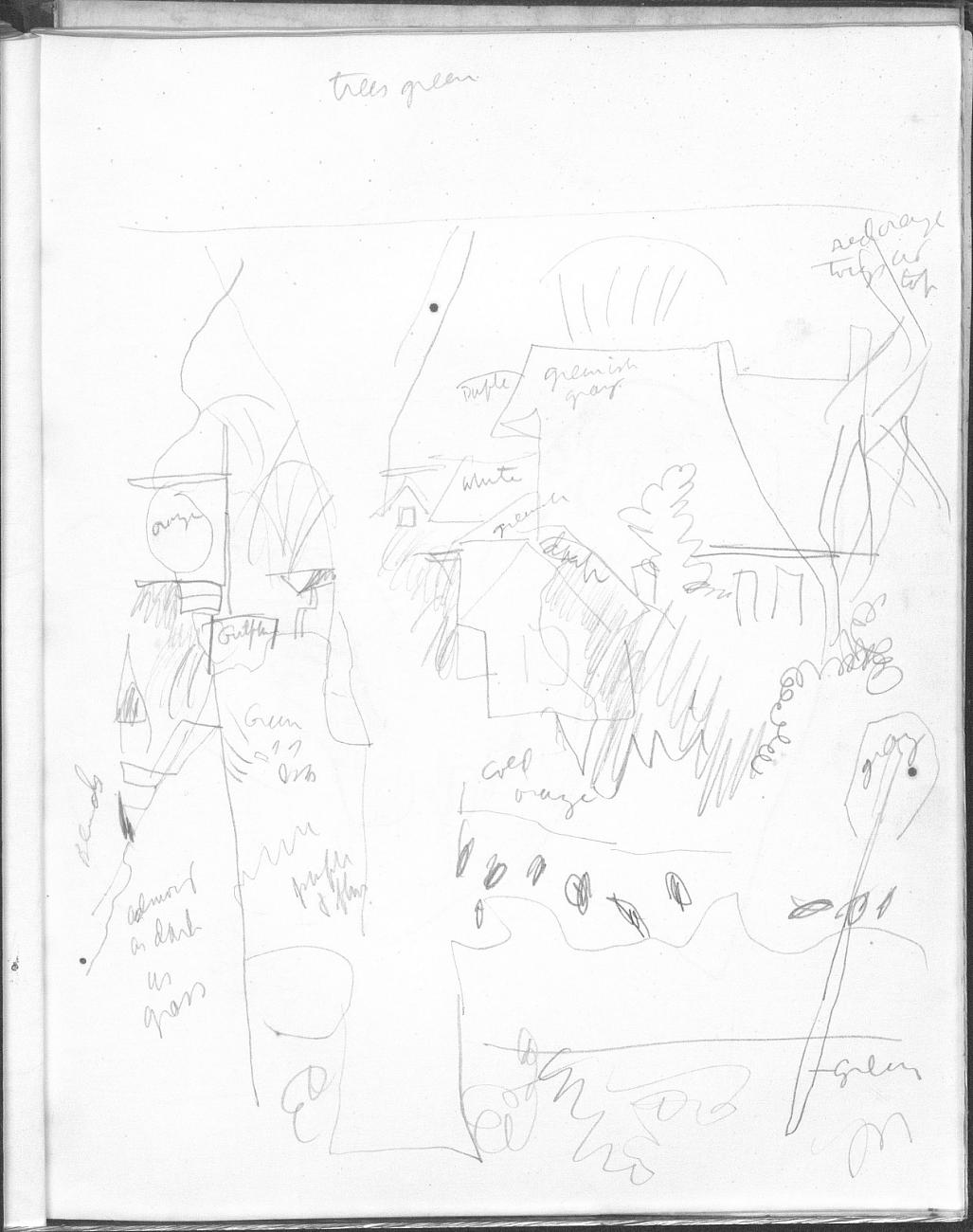
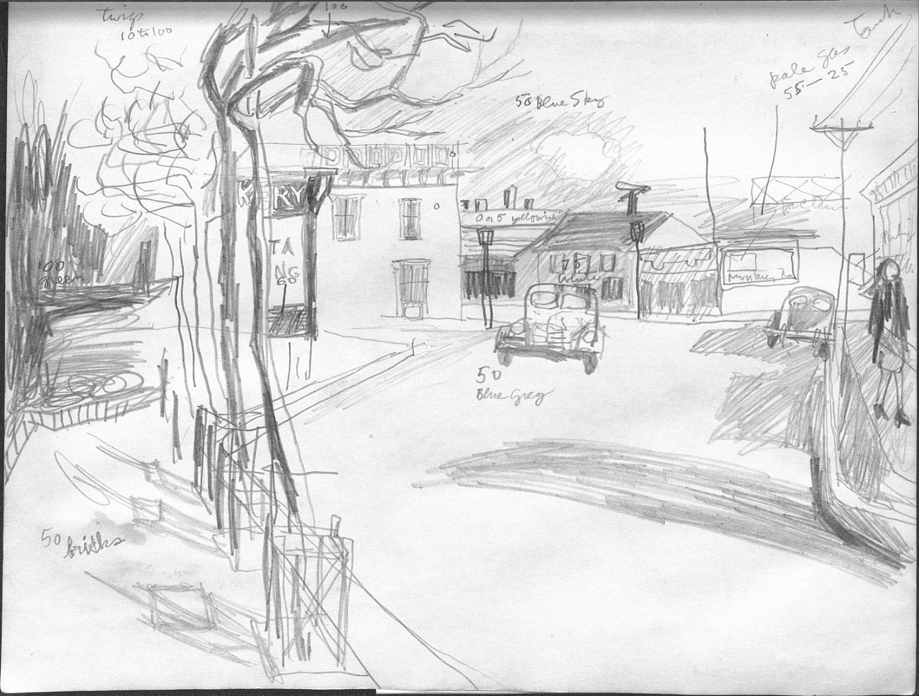
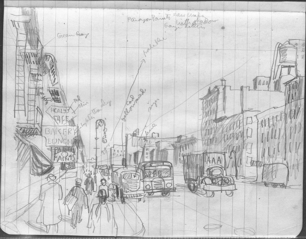
The scribbled words throughout each of them are labels Porter made to correspond to shades of paint. These sketches are painstakingly plotted blueprints. Porter’s sketchbooks testify to the artistic toil he performed to become a painter. They are the corollary to Porter’s writings on art in which he toiled intellectually to the same end. But you cannot plot your way to artistry.
While I was still in New York I called Leon Wieseltier, the editor of this journal, and explained my disappointment. “Have you ever heard of Venus Paradise?” he asked me. I hadn’t — it was the brand of Paint by Numbers Leon grew up adoring. “The trick” Leon instructed “is to stay inside the lines and keep the color smooth and solid, without internal incident… just like Fairfield Porter.” It turned out that Leon had long held a sad and dim view of Porter’s paintings (though he owns two charming Porter drawings).
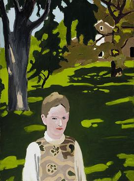
“Under the Elms,” 1972, Fair Use
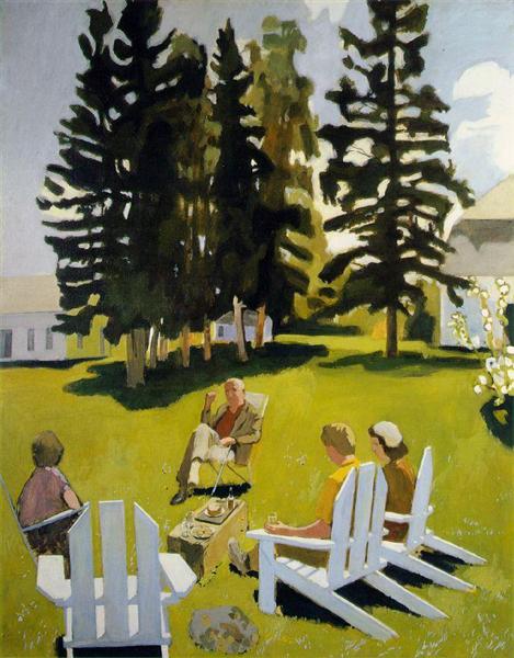
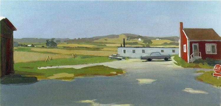
“Long Island Landscape with Red Building,” 1961, Fair Use
Yet the fact that Porter so scrupulously mapped out his paintings and labeled his hues does not answer the question: what is it that Fairfield Porter does not have? This data about his process merely describes the method by which Porter circumvented his limitation. Robbins had already established that the paint-by-numbers strategy does not in itself condemn a picture to superficiality — he did, after all, get the idea from Da Vinci. And, it must be said, Porter was an artist, if not a historic significant one, and Robbins was a salesman; Robbins was trying to sell paint, whereas Porter was trying to understand paint and to create genuine art with it. The important point is that working from a plan is not aesthetically disastrous or disqualifying. Preparatory sketches are as old as painting itself. The great masters of fresco painting and mural painting all worked from prior plans. Egon Schiele, renowned for his wildness, used to map out his compositions on graph paper in obsessive detail, and his pictures were hardly lacking in the it that I am failing to name. Schiele’s severe constraints on himself, his grids, his preparatory sketches, are attempts to gird torrents of energy and feeling so intense that, even through the straightjackets that he designed for himself, his paintings and sketches still vibrate.

There is much that an artist can learn from studying Porter’s canvases, his work ethic, his artistic autonomy as evinced both in his art criticism and in his paintings. He has considerable pictorial and painterly intelligence and a great deal of art historical knowledge. His attention to detail is admirable. His compositions are interesting and, given the atmosphere in which he created them, venerably independent. A catalog raissone of Porter’s works is available online for free through the internet archive. It is instructive to peruse its color plates. Perhaps Porter is the only painter more rewarding through a screen than in the flesh.